
— Montessori Aotearoa
Rebranding project. The brief from the client was to create a logo that represents their values and their nature.
— Montessori Aotearoa
Rebranding project. The brief from the client was to create a logo that represents their values and their nature.

There is a spirit of bi-culturalism within the organisation. So my challenge was to design a logo was Maori-inspired, had kiwiana, but without being tokenistic.

I started with a loose idea in mind of interconnecting concentric circles. I spent some time exploring this and making interesting shapes. I thought an abstract fingerprint-type symbol might work.
Then I tried the same thing, but using intersecting spirals. I started to get excited by this, as it was a nod towards the iconic ‘Koru’ pattern found in Maori art, and synonymous with New Zealand.
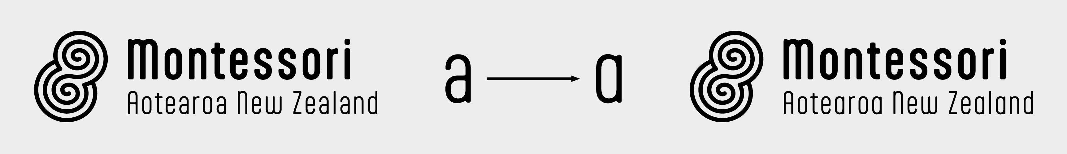
The client requested that the lower-case ‘a’ be changed from a ‘double-story’ letter-form, to a ‘single story’. This is because the single story version is the one we use when we first learn to write.
For an education organisation, this makes the lower-case form a more contextually appropriate form.
The typeface didn’t have a lower-case glyph, so I created one using the other letters to guide me.

The logo is a strong enough icon to be either stand alone, or be used as a background pattern